|
Nana C++ Library. Reference for users.
What we need to use nana
|
|
Nana C++ Library. Reference for users.
What we need to use nana
|
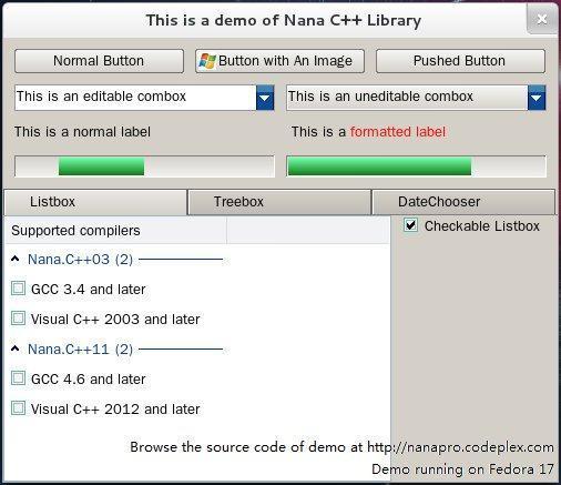
| Name | ..........................Picture............................ |
|---|---|
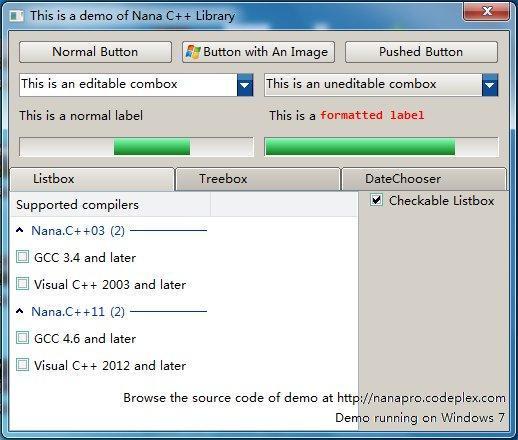
| button, Manual Responds to user clicks. | 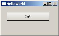
|
| categorize, Represent an architecture of categories and what category is chosen. The categorize widget can be used for representing a path of a directory or the order of a hierarchy. | 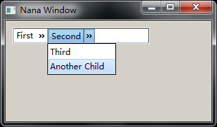
|
| checkbox, Manual, User toggles a boolean. With the radio mode, users make a choice among a set of mutually exclusive, related options. Users can choose one and only one option. | inside a group 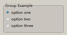
|
| combox, Manual User selects from drop-down list. This widget is a combo box which consists of a list box combined with a textbox. The list box should drop down when the user selects the drop-down arrow next to the control. The text can be editable. | 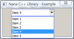
|
| date_chooser , Manual A graphical user interface for choosing a date. | 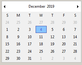
|
| form , Manual Represents a popup window. Overall it is a root widget, which attaches the OS/Windowing system native window. | ![]() |
| group, Manual A group box provides a frame, a title, and displays various other widgets inside itself. It automatically lays out the child widgets if these child widgets are inserted into the group internal place field. | 
|
| label, Manual It can be a very simple static text, or a sofisticated formated, aligned and responsible to commands (enter, leave and click) dynamic text label including imagenes. You can get the precalculated exact size. Examples: 1 | 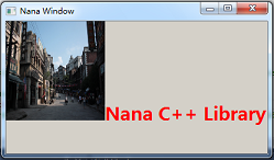
Label with image |
| listbox, Manual list of categories with in turn contain items. A category is a text that can be expanded to show the items. Cotegories and items can be selected and checked. An item is formed by columns (fields) corresponding to the headers. Drag the header to reisize or reorganize it. Click on a header reorder the list up and down alternatively | 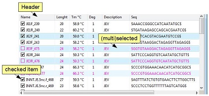
|
| menu, Manual A list of items that specify options or group of options for an application. | 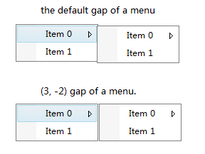
|
| menubar, Manual Is a toolbar at the top of window for popuping menus. | ![]() |
| nested_form, Manual Represents a native window to be a child of other form. Overall it is a root widget(see Overview of widgets) which attaches the OS/Windowing system native window. It represents a form as a child of other form, using this feature, you can dock other native windows to the nested form, such as a web browser ActiveX control. | ![]() |
| panel, Manual For placing other widgets | ![]() |
| picture, Manual Rectangle area for displaying an image. | ![]() |
| progress, Manual A progress bar with two possible styles: known amount, and unknown amount value (goal). In unknown style the amount is ignored and the bar is scrolled when value change. | ![]() |
| scroll, Manual Provides a way to display an object which is larger than the window's client area. | ![]() |
| slider, Manual User selects value from graphical number range by draging for tracking. | ![]() |
| spinbox, Manual. Choose a value in the specified range. Supports groups of integers, doubles or texts. | 
|
| toolbar, Manual a control bar that contains buttons | ![]() |
| tabbar, Manual Analogous to dividers in a notebook or the labels in a file cabinet. | 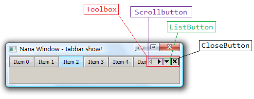
|
| textbox, Provides a widget that is used to input and display text. It supports three modes: single line, multiple lines and line wrap. | 
|
treebox, Manual Displays a hierarchical list of items, such as the files and directories on a disk. The nodes contain a text and can be (events) expanded, checked, selected and hovered. Data of any type can be optionally atached to each node using item_proxy:Manual | 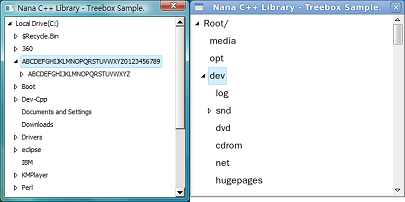
|
frame, radio_group, User selects from displayed options.
 1.8.5
1.8.5 
